Key Advantages: Exceptional visual immersion, seamless mobile responsiveness, and modern, clean code architecture.
Critical Disadvantages: Significant reliance on high-quality media assets and limited suitability for information-dense, text-heavy websites.
Design Philosophy and User Experience
The core identity of the Bokeh template lies in its full-screen architecture. Most modern web designs utilize a "container" approach to keep content centered with margins on the sides. Bokeh breaks this convention. It utilizes every available pixel of the user's viewport. This creates an immediate sense of depth and scale.
The User Interface (UI) is intentionally stripped down. Navigation elements are unobtrusive. This design choice prevents "visual noise." The focus remains entirely on the hero imagery or video backgrounds. For photographers, cinematographers, and digital artists, this is a significant advantage. The template acts as a professional gallery that commands attention.
Responsive Engineering
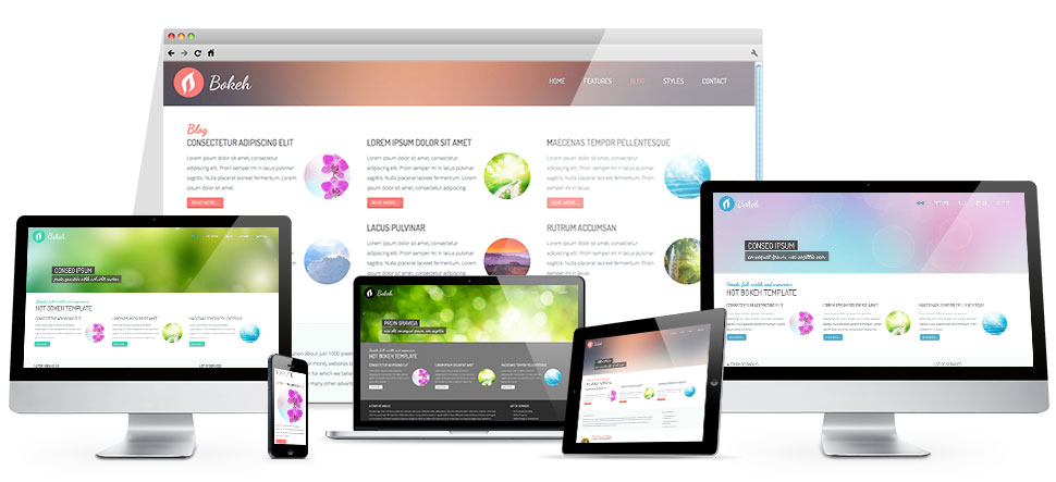
In the current mobile-first era, responsiveness is non-negotiable. The Bokeh template employs fluid grid systems. It adapts dynamically to various screen resolutions. Whether viewed on a 4K monitor or an iPhone, the layout maintains its structural integrity. The scaling of large images is handled via modern CSS techniques. This ensures that the "full screen" effect is preserved across all devices without breaking the layout.
The template uses media queries effectively to reposition elements for smaller viewports. Navigation menus often transition into streamlined, touch-friendly overlays. This prevents the user from feeling overwhelmed by small buttons or overlapping text on mobile screens.
Technical Customization and Integration
From a developer's perspective, Bokeh offers a structured environment. It integrates deeply with the Joomla CMS core functionality. The template utilizes standard Joomla module positions. This allows administrators to deploy content without writing complex code. The use of Bootstrap-based frameworks (or similar modern CSS standards) ensures that developers can extend the styling easily.
The customization workflow is efficient. It supports easy implementation of custom CSS overrides. For those familiar with web development, modifying the z-index or opacity of overlays is straightforward. This flexibility allows a user to fine-tune the balance between text legibility and background imagery.
Analyzing the Weak Points
Despite its aesthetic strengths, the Bokeh template has notable technical vulnerabilities. The most prominent weakness is its asset dependency. A full-screen template is only as good as the images it hosts. If a user uploads low-resolution or poorly compressed files, the entire professional illusion collapses. The design reveals flaws—such as pixelation or stretching—much faster than a standard boxed layout.
Furthermore, there is a performance risk. Large, high-definition images and video backgrounds can significantly increase page load times. Without aggressive use of WebP formats and Content Delivery Networks (CDNs), the site may suffer from high latency. This can negatively impact SEO rankings and user retention.
Lastly, the template is a niche product. It is not an all-purpose solution. If your goal is to run a news portal or a technical documentation site, Bokeh is an inappropriate choice. The lack of "white space" for dense text blocks makes it difficult to present large amounts of information without overwhelming the reader.
Final Verdict
The Bokeh Full Screen Template is a premium choice for specific use cases. It excels in portfolios, brand showcases, and visual storytelling. Its ability to leverage the full screen creates an unforgettable first impression. However, users must possess high-quality media assets and understand the importance of image optimization.
If your content is visual-heavy and you prioritize aesthetics over information density, Bokeh is a top-tier investment. For those managing text-centric or data-driven websites, look elsewhere for a more traditional layout.