Mobility - Joomla iPhone Template
This is a completely new responsive Joomla! iPhone template that has the same name as our old template, released about 8 years ago. Things are changing in this industry almost on a monthly basis. People are browsing the internet using mobile devices more than ever! In the early ages of the mobile devices industry, websites usually had a separate version optimized for small mobile devices only. Today, responsive design is a must!
Why Mobility - Joomla iPhone Template
- Responsive template, based on clean HTML5/CSS3 code.
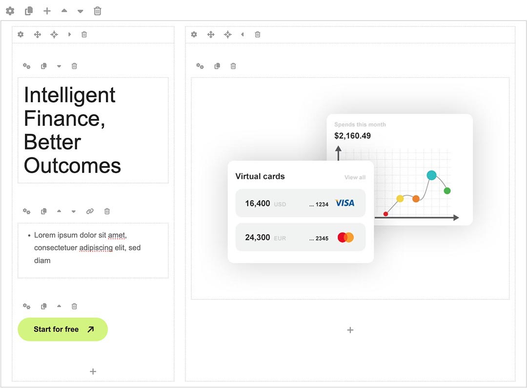
- Customisation of the template's layout and adding/removing module positions is easy. It's powered by Sparky's drag-and-drop Layout Editor. Change layout and element dimensions easily whenever you need.
- Retina-ready images in articles, custom modules, and carousel. Full support for modern screens with double pixel density.
- We included several responsive Joomla modules with this template. Hot Swipe Carousel (retina ready and powered by CSS animations), Hot Slicebox , Hot Responsive Lightbox , Hot Maps and Rapid Contact. All these modules are included with this template without any additional fees (you save $19 per commercial module).
- HotStart (SQL dump) available with both a single purchase and any membership plan. It copies the template with all extensions and demo pages easily.
- An unlimited number of module positions can be added easily within the Layout Editor of Sparky Framework if needed.
- PSD source file and fonts are included.
- Total control of all menus through the framework. You can set the functionalities and style of all your menus and drop them directly into the layout. This template uses a Drop-down menu, which allows multiple levels of menu items to be included in the drop-down panes.
- This template has been tested with Chrome, Edge, Firefox, IE10+, Opera, and Safari browsers on PC and Mac computers. It's also tested on iOS and Android mobile devices.
- Support for RTL (right-to-left) languages.