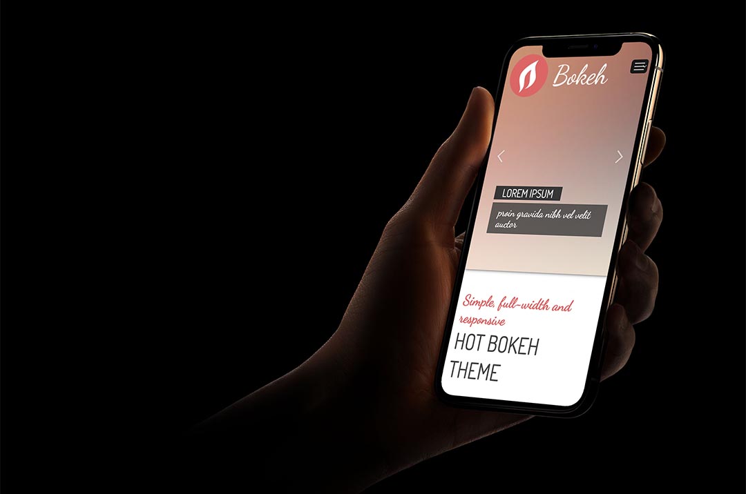
Bokeh — Full Screen WordPress Theme
Full screen WordPress theme is specific. It always occupies all screen space, regardless of screen size. Making an eye-pleasant design throughout all screen sizes is now easily achievable. The Hot Bokeh theme has been designed to use the full screen space, regardless of the screen size. We did our best to make it look good on both smaller screens and also on gigantic screens.
Why Bokeh — Full Screen WordPress Theme
- This theme is based on a clean and valid HTML and CSS code. We tested it using the W3C validation tool to ensure it’s 100% free of errors.
- The Hot Bokeh is a responsive multipurpose WordPress theme. This means it will look good and be optimized on all desktop and notebook computers, as well as mobile devices (tablets and smartphones). The theme layout will be adapted to the screen size. The menu will be converted to a button on smaller screens.
- Layout Builder is where you control the theme layout in a few simple steps. Click the “Add Row” button to make some rows. All widget positions and special elements are represented as cells. Drag some of them into the rows. Add a specific name and/or class to any row to select it and style it through CSS. In the background, the theme creates your layout fully automatically accordingly to the settings from the Layout Builder.
- Many options are available in the the Template Options . You can change the logo, background image, all fonts, menus, and other aspects of your site.
- This theme is shipped with demo data . If you follow our simple instructions, you will get a pixel-perfect copy of our demo site.
- Our products are well-documented, but if you run into the problems with theme installation or usage, post your question and our support staff will help.
- Tested with Google Chrome, Mozilla Firefox, Microsoft Edge, Apple Safari, and Opera browsers. Tested on Apple iOS and Android mobile devices. Support for RTL (right-to-left) languages.
- This theme is shipped with PSD files and fonts . If you need to modify our design or any part of the theme, it can be done in Photoshop, using the source files.
- This theme is shipped with sets of .mo and .po files that can be used to translate the theme. Also, the theme works with RTL languages.
- All the plugins that you can see on the demo are included in the price. If you install the theme with demo data, all plugins will be installed as well.
- This theme contains 17 positions where you can place your WordPress widgets. The detailed “map” of all widget positions is available in the theme options panel.
- This theme has an integrated responsive top menu script with support for multiple levels. Sub-levels are displayed as drop-down panes.

The Hot Bokeh is a responsive WordPress theme. This means it will look good and be optimized on all desktop and notebook computers, as well as mobile devices (tablets and smartphones).
Layout Builder is where you create a layout for your website in a few simple steps. Click the “Add Row” button to make some rows.\n\nAll widget positions and special elements are represented as cells. Drag some of them into the rows. Add a specific name and/or class to any row to select it and style it through CSS. In the background, Sparky creates a layout fully automatically according to the settings from the Layout Builder.